COLOR: psychology behind the design
By: Lexi Johnson
Is color your best friend or do you find comfort in neutrals? Bright and bold or more on the subtle side? We see trends come and go with each season, and this year color is in!
Just like how darkness and temperature can affect one’s mood, color can have the same effect. The psychology of color has been the focus of many studies. According to the London Image Institute, these are the effects each color primarily has:
RED – love & energy ORANGE – confidence & sociability YELLOW – creativity & happiness
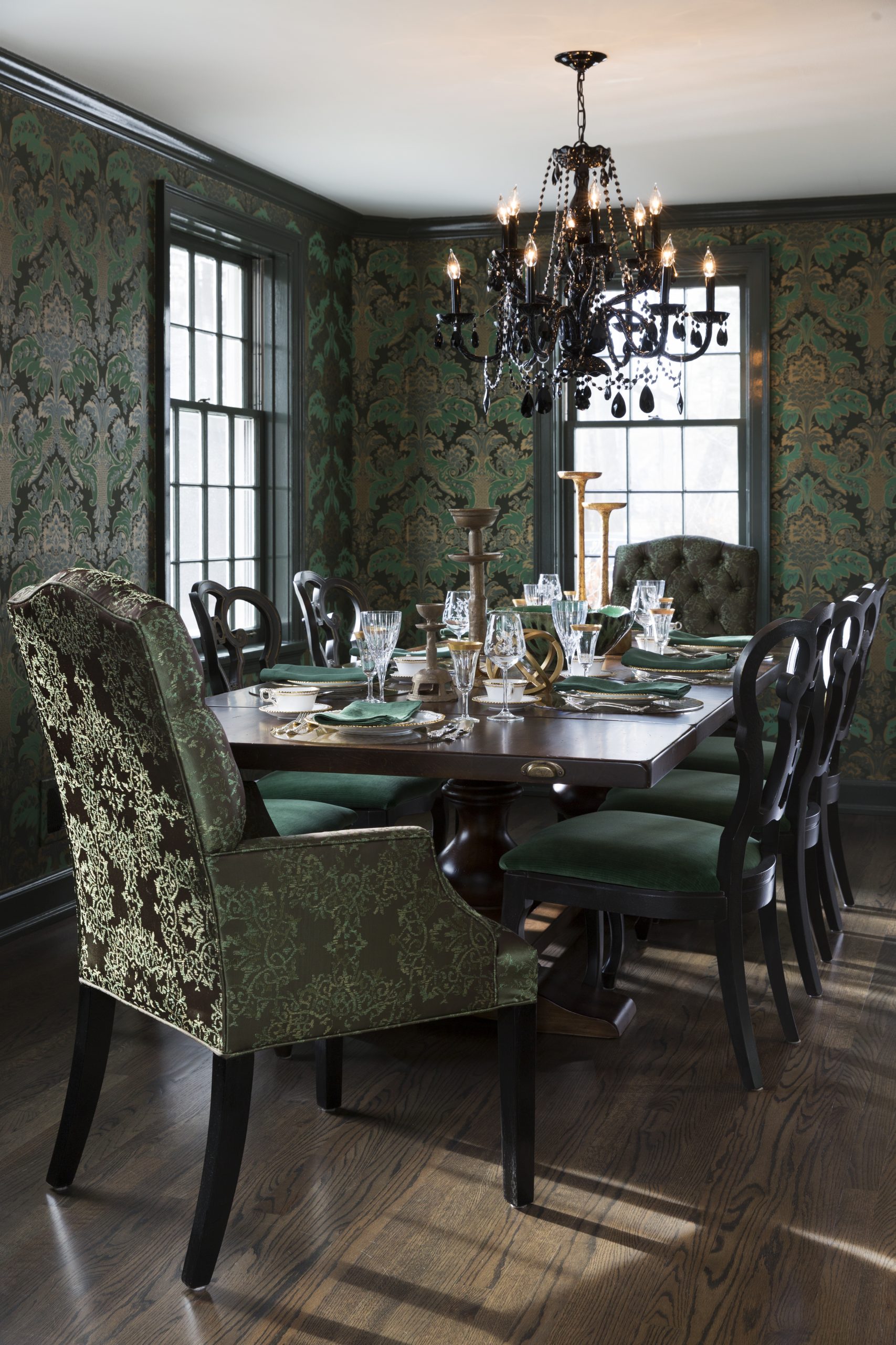
GREEN – nature & healing BLUE – peace & loyalty PINK – compassion & sincerity PURPLE – royalty & spirituality
BROWN – dependability & ruggedness BLACK – formality & drama WHITE- cleanliness & simplicity
Similarly to how moods and thought processes can be impacted, color can translate into the room’s atmosphere. Play around with the tones and saturation to help coordinate your design scheme.
One versatile thing about color is the range of value. You can take it as vibrant or muted as you please. Value refers to how light or dark a color is. There are many ways to incorporate it into a visually pleasing and cohesive design. Some of our favorite ways are:
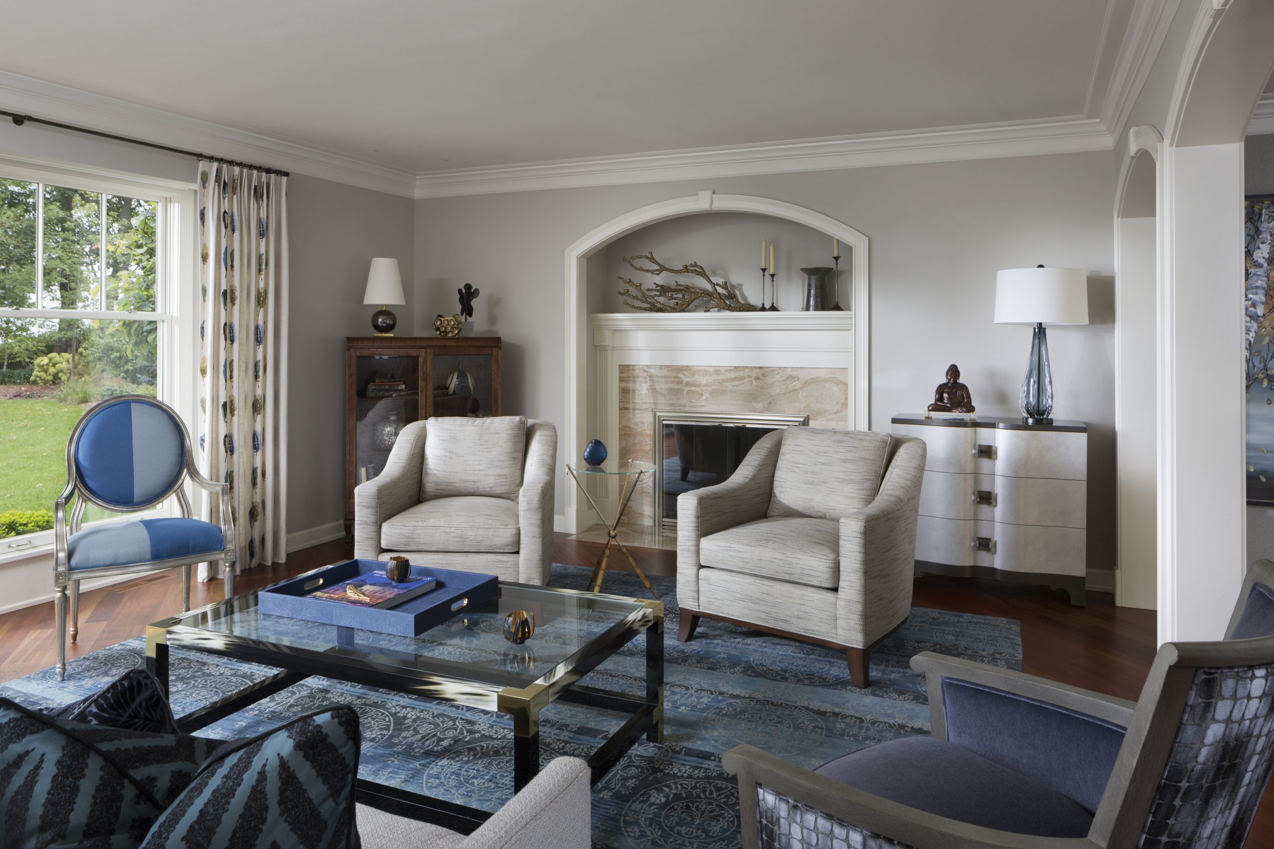
RUGS
The wonderful thing about rugs is how much warmth they can add to a space. You can completely change the atmosphere. They are also a great way to divide a large room into smaller areas. Nowadays you can find them in every color, texture, and pattern. Using a rug to tie together accent colors is a great way to create a cohesive design.
PILLOWS
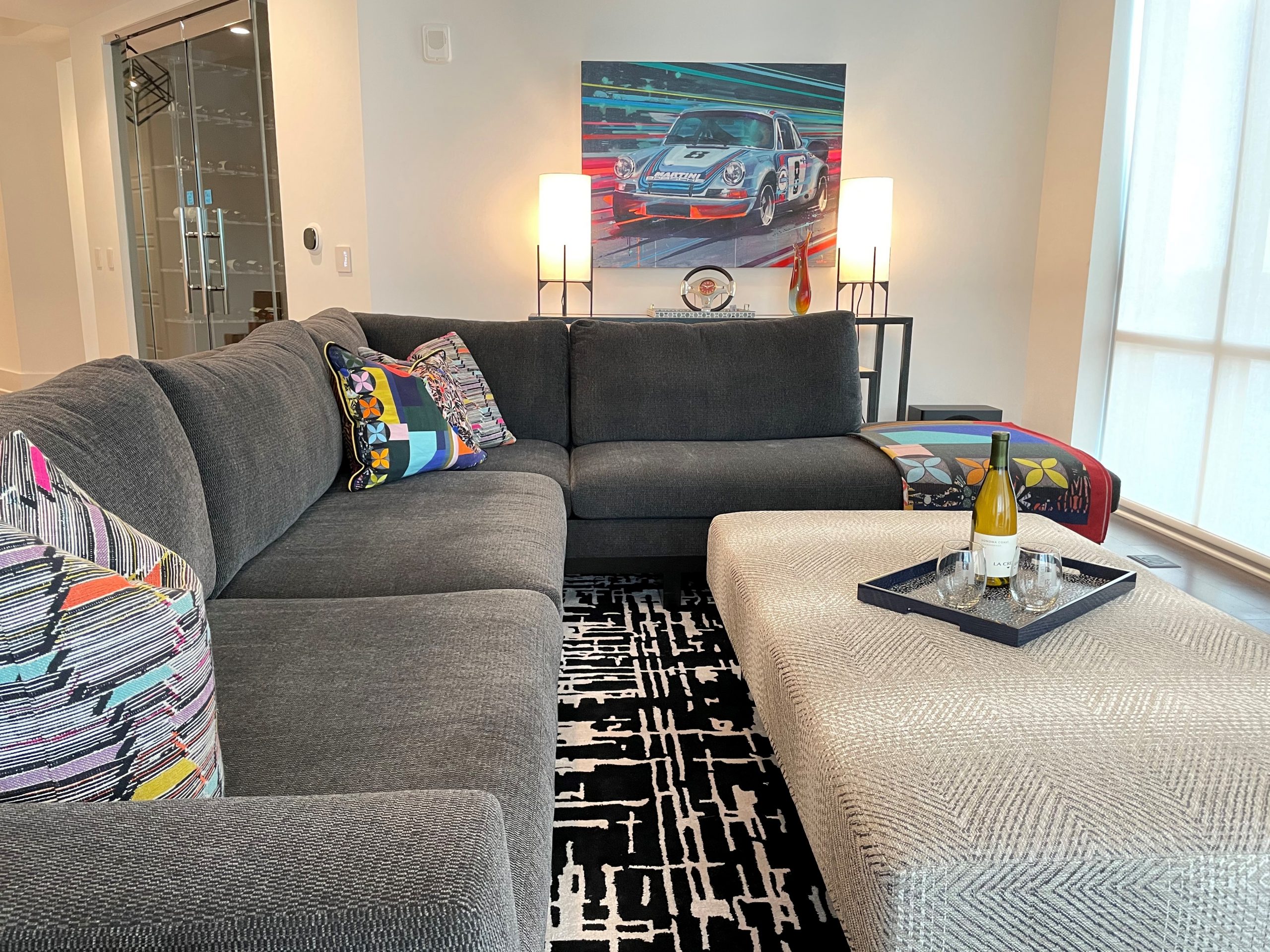
Additionally, one of our favorite ways to bring life to a design scheme is by custom pillows. The options are endless! With hundreds of fabrics to choose from, we can find the right combination for every client. This is a great way to draw in color without it taking over a room. You can choose a coordinating or contrasting fabric to whatever item it is placed on. This example is from a Nashville project. By keeping the large scale pieces neutral, the custom pillows and throw help to tie in the client’s art to the design as well as give a focal point.
WINDOW TREATMENTS
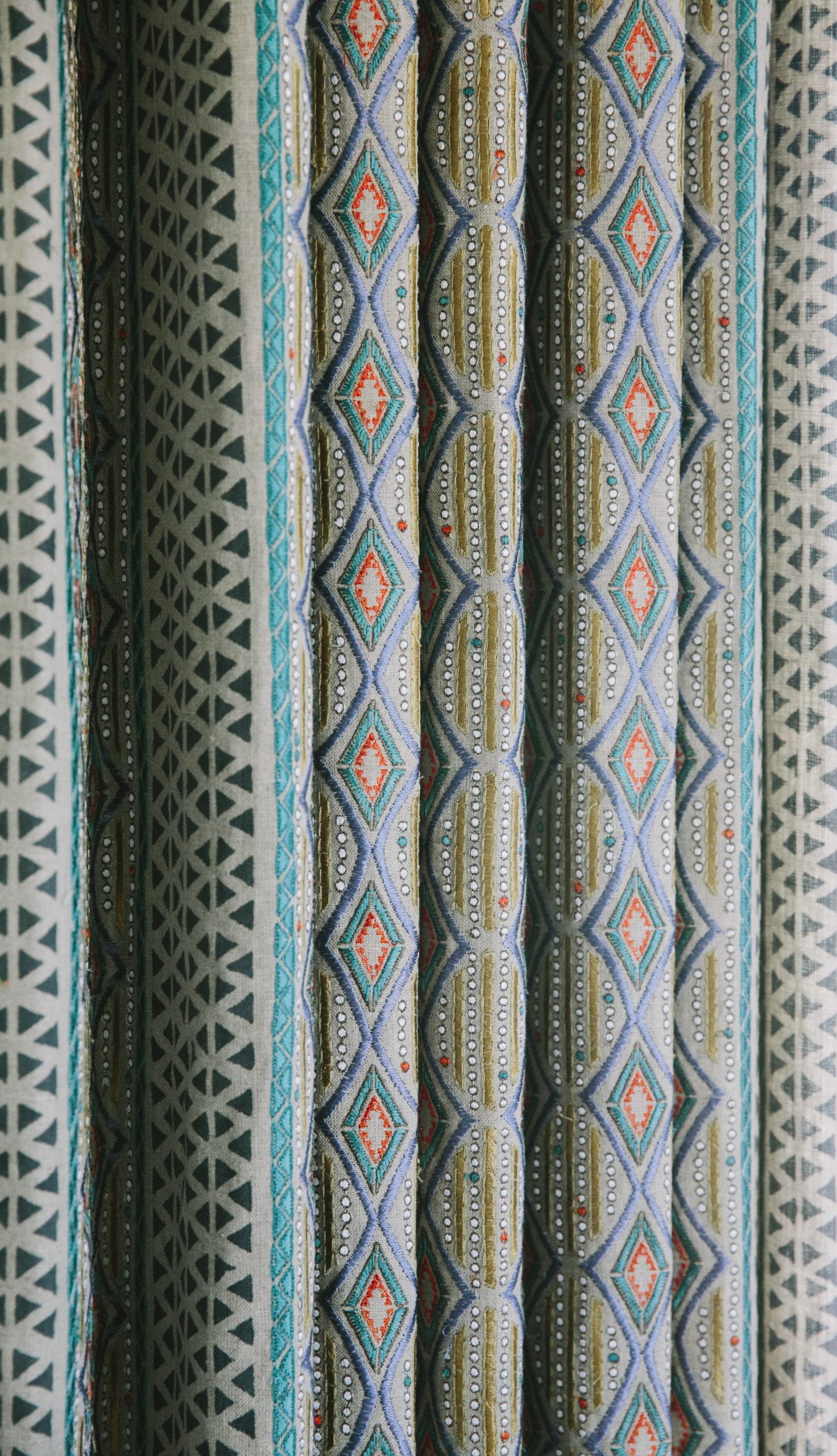
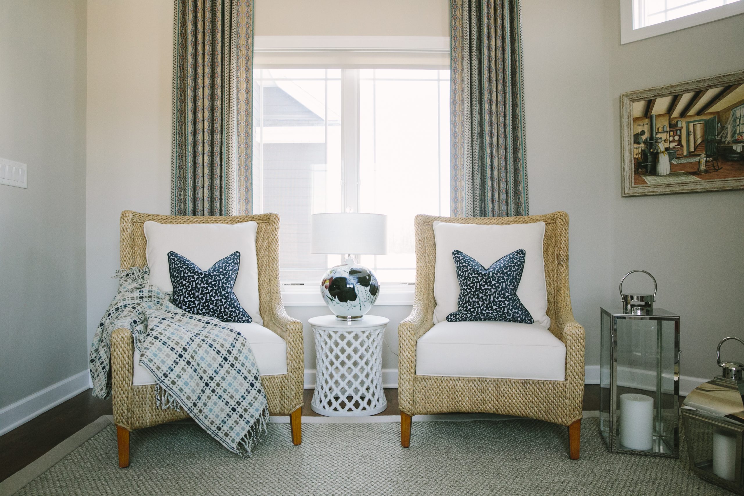
The large scale of sheers and drapes have the ability to under or overwhelm a space. Keep this in mind when deciding how much light needs to filter in. There are plenty of options to choose from! If a neutral color palette is the look you’re going for, consider a fabric that has some texture or embellishing for a fun twist!
WALLPAPER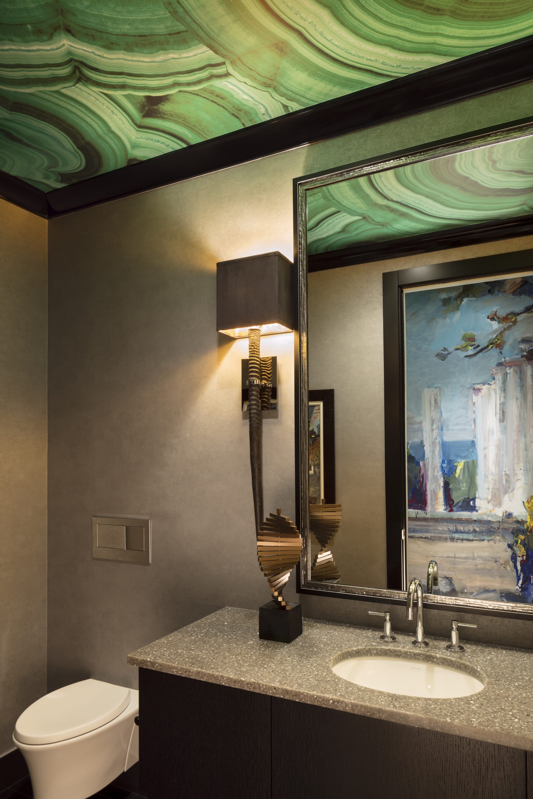
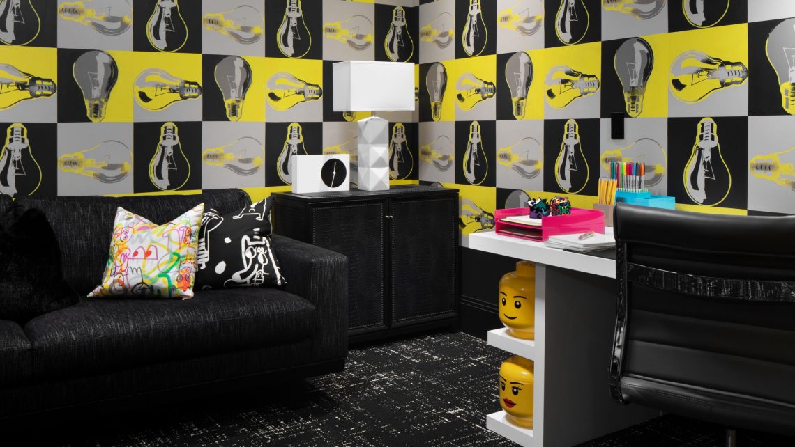
When people think of wallpaper, sometimes their first thought is what is typically found in older homes. We’re here to break away from this idea! Choose an abstract pattern, something nature inspired, or a metallic texture to add definition to a flat wall. We love how unexpected it is to have wallpaper on the ceiling too.