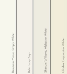
 At first glance I was surprised that these four major paint brands chose to go with an achromatic color, but after more thought and research this unified choice started making sense. Pantone’s color of the year is driven by design, fashion, and art. Whereas these major paint companies’ color of the year has always been driven by their customers and designers. While these hues of off-whites seem nothing like the soft pink and pastel blue of Pantone, there’s a softness in these colors that unifies them.
We’re in an era of technology all day, every day – with the world at our fingertips, it makes sense that colors that promote relaxation and purity are what we want to see more of. White gives our minds a fresh outlook, like the beginning of a new year, and while it helps our minds relax our creative energy takes over generating new ideas.
Close your eyes and imagine yourself standing in an open field with a fresh layer of snow crunching under your boots as you walk closer to the tree line. Every tree still has a dusting of snow on its branches from the snowfall the night before. You breathe in the crisp winter air and feel a sense of peace. I have to ask myself “Do I feel so relaxed because I’m outside, because snow is white, or maybe is it a mixture of both?” Or maybe you’re sitting on a white sand beach, hearing the waves crash onto shore, again why are you so relaxed? Maybe it’s time we take a cue from Mother Nature.
“When an entire room is a palette of white, we notice the quality of the surfaces. It stimulates the sense of touch. And our sense of sight can relax.”
– Kelly Slank
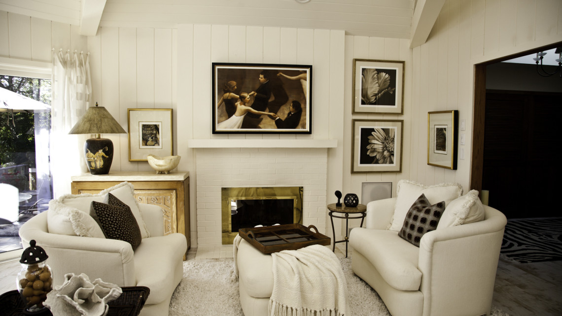
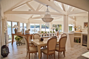
Whenever I walk into a home with a neutral color palette I instantly feel relaxed. I notice the pieces of furniture, the textures of the fabrics, the way the art speaks off of a white wall. It creates a visually interesting and welcoming space. Whether you’re a lover of white walls or bold colors on your walls, adding white trim creates a crisp, modern look and doesn’t compete with the pieces in the space.
Whether you’re painting the walls in your home, walking on a white sand beach or watching delicate snowflakes fall from the sky it’s undeniable that the color white speaks to people across the globe. If you’re having trouble picking what tone of white is perfect for you and your space let one of the designers at Haven Interiors help guide you!